More than a logo
A logo identifies a business. A brand identity makes every place that business appears look like one company: the invoice, the sign over the door, the van, the team T-shirt and the next social post. The difference shows the first time a printer asks for a vector file, a sign maker asks for the exact gold, or a new team member designs a flyer. With an identity in hand, each of those questions already has a written answer.
This guide walks through the parts of a complete identity, with examples from brand books and rollouts we have built.
The logo, in every version it needs
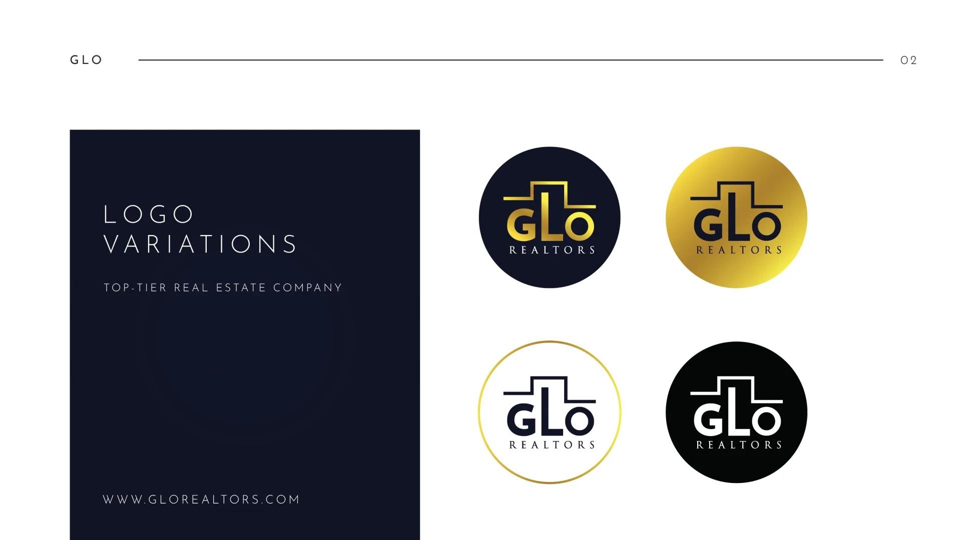
One drawing of a logo is a starting point. A working identity carries a small family of versions, each with a job:
- Primary lock-up: mark and name together, for signs, documents and the website header.
- Alternate layout: stacked or horizontal, for spaces where the primary shape sits awkwardly, such as a square profile picture or a long, narrow banner.
- Icon or monogram: the mark alone, for favicons, app icons, watermarks and embroidery on a cap.
- Colour versions: full colour, one colour and reversed, light on dark, for photographs, one-colour prints and dark backgrounds.
Two rules travel with every version. Clear space is the margin kept free around the logo, usually measured with a part of the mark itself, so it scales with the logo. Minimum size is the smallest width at which the logo stays readable, set separately for print and screens. Both belong in the brand book, with numbers.
A palette with numbers attached
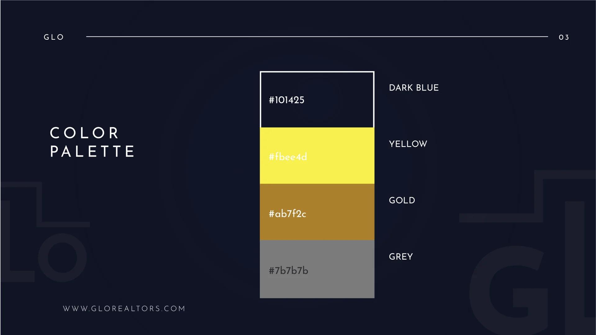
“Navy and gold” is a mood; #101425 is a colour. A palette gives each colour the values every medium needs: HEX and RGB for screens, CMYK for printing presses, and often a Pantone reference where a colour has to match exactly across signs, uniforms and packaging.
| Colour | HEX | Contrast on dark blue |
|---|---|---|
| Dark blue | #101425 | Base colour |
| Yellow | #fbee4d | 15.2 : 1 |
| Gold | #ab7f2c | 5.1 : 1 |
| Grey | #7b7b7b | 4.3 : 1 |
Those ratios decide where each colour can carry words. The Web Content Accessibility Guidelines ask for at least 4.5 : 1 for normal text and 3 : 1 for large text (WCAG 2.2). Yellow and gold pass comfortably on the dark blue, and the grey suits large type and fine details. The same yellow measures 1.2 : 1 on white, so it lives on the navy: a decision the palette makes once, for everyone who uses it.
Typefaces, with their licences
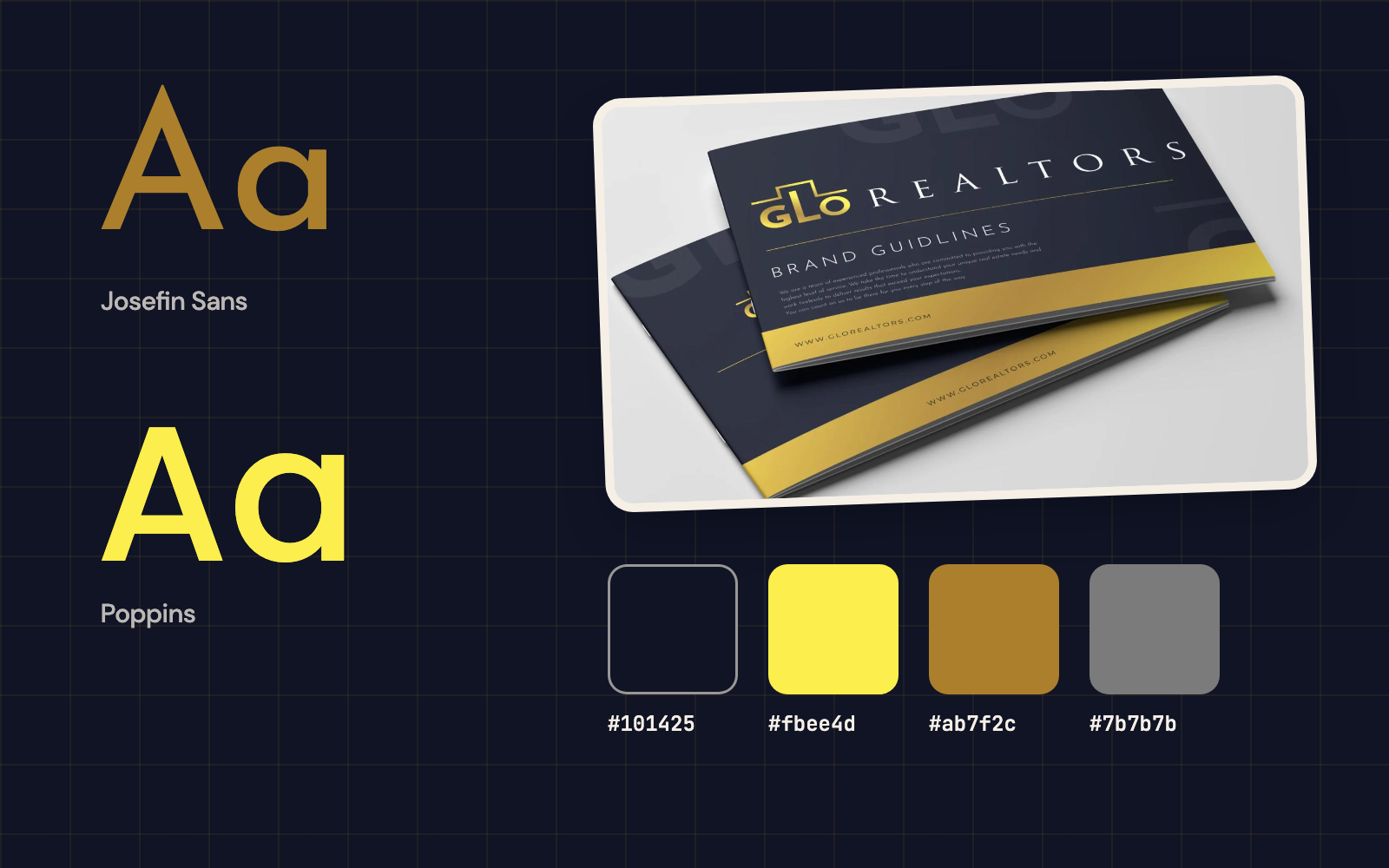
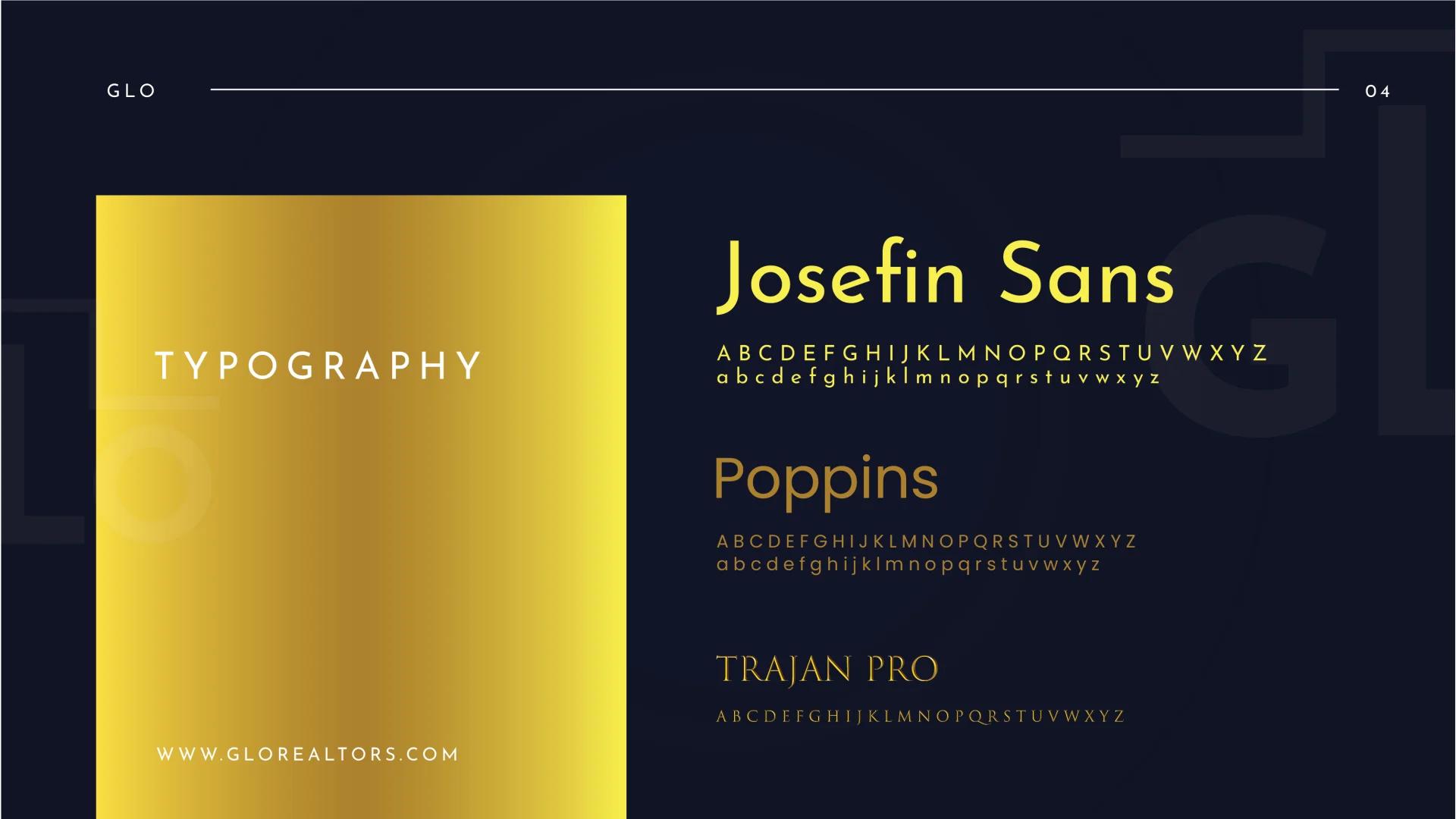
That brand book names three typefaces: Josefin Sans, Poppins and Trajan Pro. Naming them is half the job; the other half is the licence, because a typeface is software and each use needs permission.
Josefin Sans and Poppins come from Google Fonts under the SIL Open Font License, which allows commercial use in print, on websites and in apps (Josefin Sans, Poppins, the licence). Trajan, drawn by Carol Twombly and Robert Slimbach for Adobe Originals, comes through Adobe Fonts with a Creative Cloud subscription, and Adobe sells separate licences for app embedding and self-hosting (Adobe Fonts). Settled before launch, the licences keep the identity usable everywhere it is meant to go.
Guidelines anyone can follow
The brand book is the identity written down, so anyone can apply it the same way. A complete one covers logo usage, colour, typography, brand voice and how the identity applies across every touchpoint. Useful brand books share a few habits: approved logo uses shown beside the edits that break them, such as stretching, recolouring and crowding; every colour with all its values; type sizes for headings and body text; and real examples of the identity at work.
Where an identity proves itself
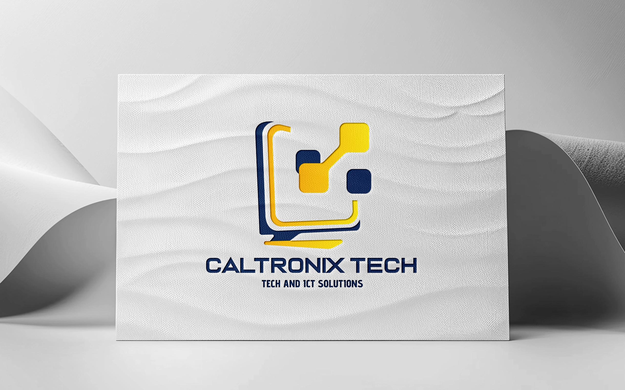
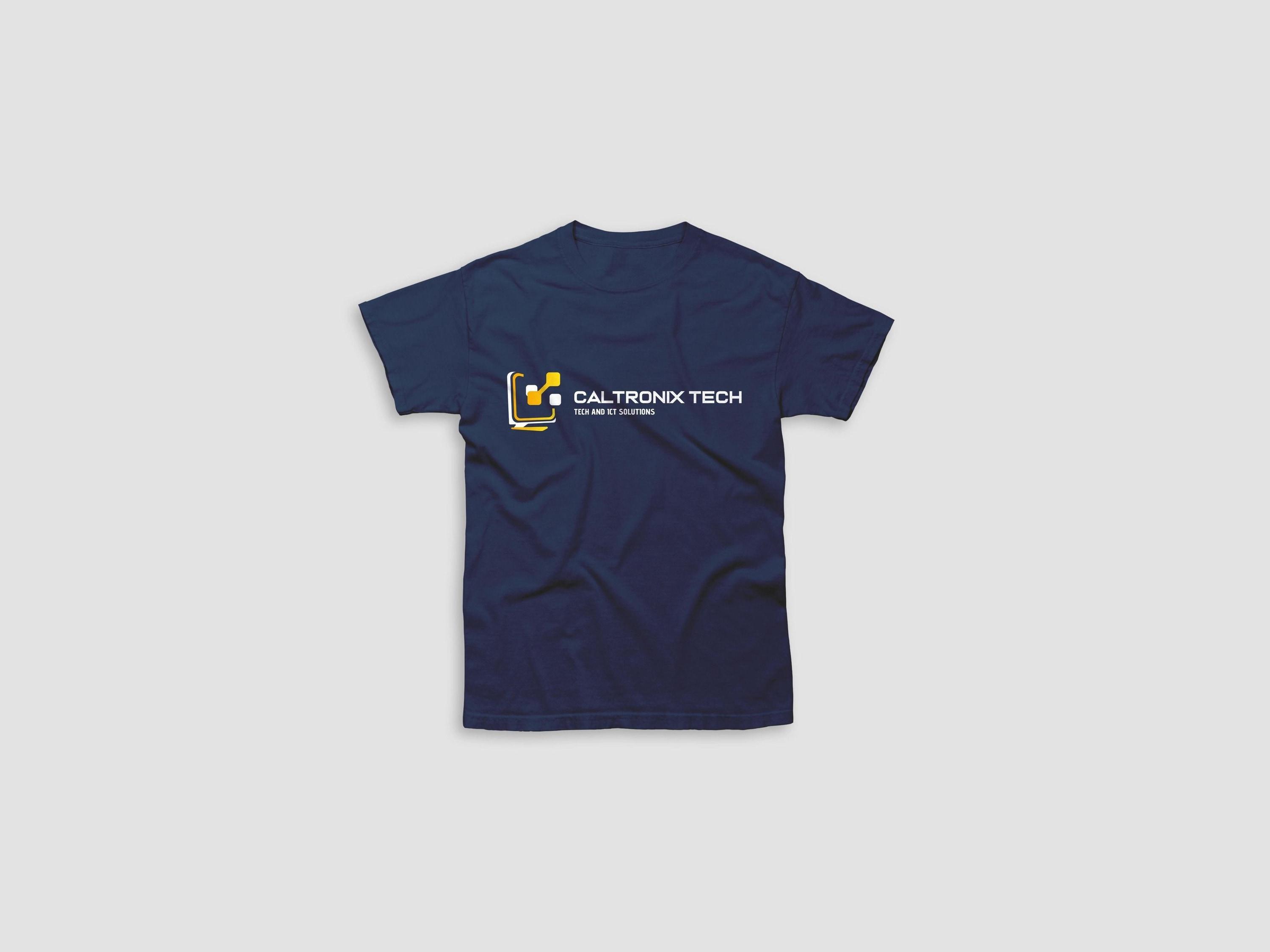
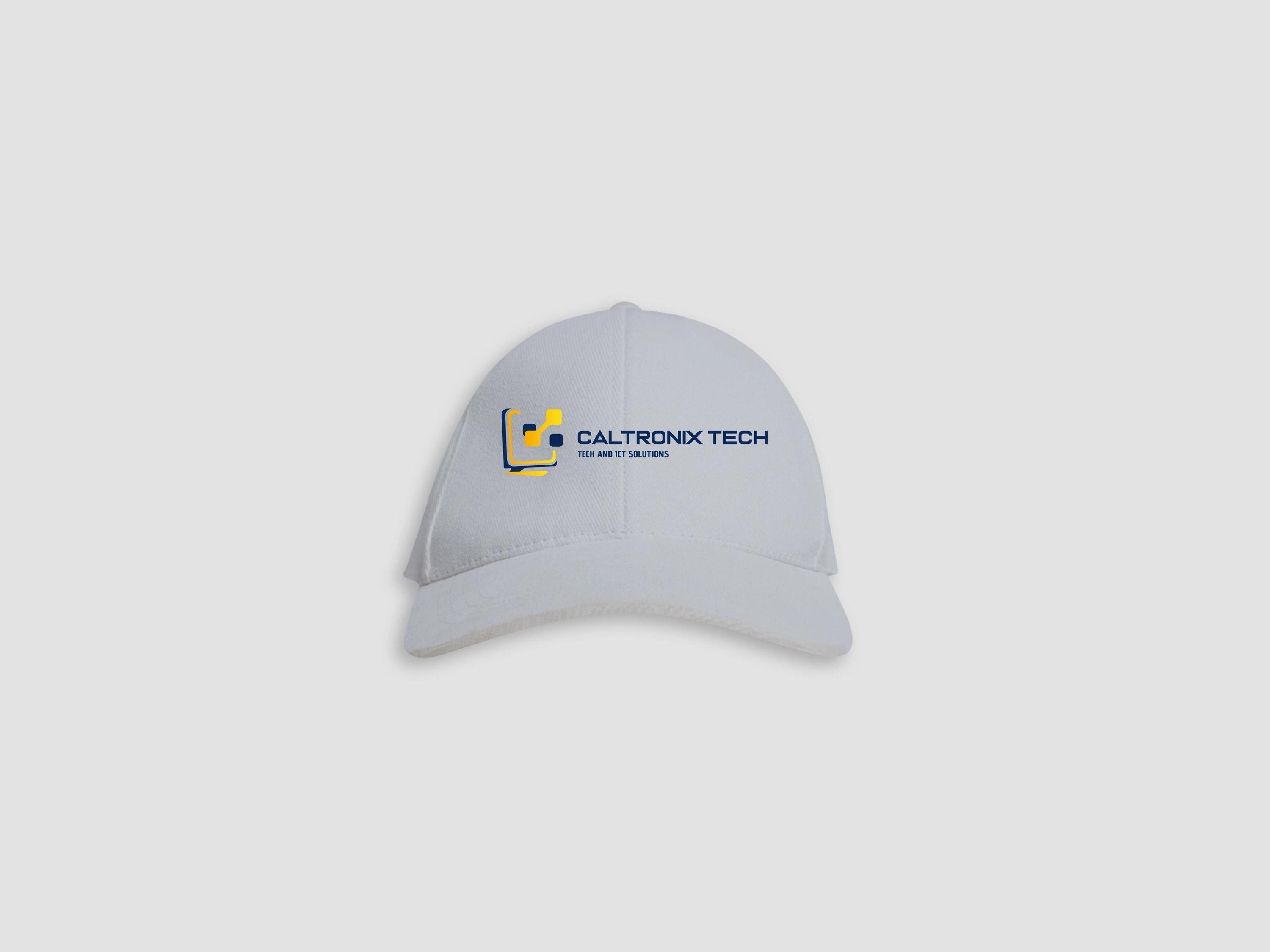
Real objects test an identity in ways a screen hides. A business card sets the mark beside an address block, a T-shirt puts it on dark fabric, and a cap shrinks it onto a curve.
A monogram meets a different test: luxury, held at the same standard on a business card, a gift box and a hang tag.
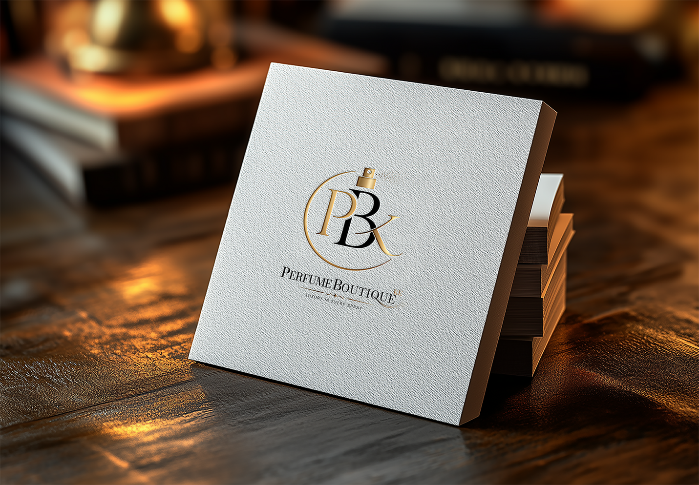
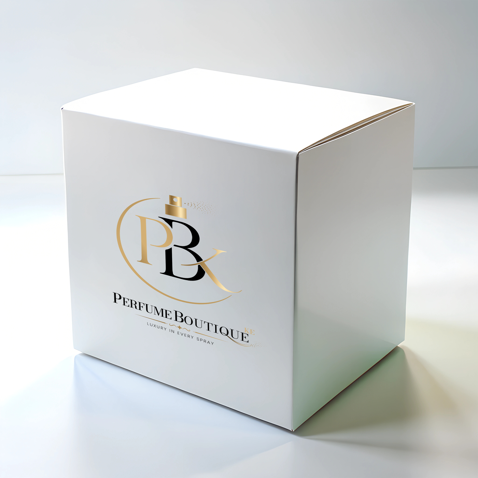

At the other end of the scale, a mark runs across a reception wall in gold lettering.

The files to expect at handover
A finished identity arrives as a folder that answers every request a supplier can make:
| File | What it is for |
|---|---|
| SVG | Websites and apps; vector, so it stays sharp at every size |
| PDF, EPS or AI | Printers, sign makers and embroiderers; vector artwork at any size |
| PNG with transparency | Documents, slides and social posts |
| JPG | Photographs and mockups |
| Colour values | HEX and RGB for screens, CMYK for print, Pantone where colour must match |
| Typefaces | Names, sources and licence terms |
| Brand book (PDF) | The rules, for every designer and supplier who follows |
- IllustratorAI, EPS, PDF, SVG
- CorelDRAWEPS, PDF, SVG
- FigmaSVG, PNG
The vector files open in the programs printers and designers already use, from Illustrator and CorelDRAW to Figma. Each logo version should come in RGB for screens and CMYK for print, named so anyone finds the right one quickly: Brand_logo_primary_gold_RGB.svg tells a printer what it is; final-v2.png starts a conversation.
The files belong to the business: the logo, the source artwork and the brand book, handed over in its own name, ready for any printer or designer it works with later.
A checklist before signing off
- The logo reads at its smallest planned size, as an icon and in one colour.
- Every colour has HEX, RGB and CMYK values, and the text colours pass a contrast check.
- Each typeface is named with its source and licence.
- Vector files cover print, and SVG covers the web.
- The brand book shows the identity on the documents, signs and social posts used every day.
- All files and source artwork arrive in the business’s name.
Our Logo & brand identity work delivers every item on this list.
Sources
Contrast ratios computed from the palette’s HEX values with the WCAG relative luminance formula.
- Published
- Author
- Booban Net.
- Category
- Brand & Design
- Service
- Logo & brand identity